Theming and Skinning Older SDKs
Theming - 3.7.x and above
You can refer to the following sample app which implements theme inheritance -
| HSThemeApp | show theming capabilities of the helpshift android sdk. |
Helpshift Android SDK comes with three different themes -
Helpshift.Theme.Light.DarkActionBar(Set by default)Helpshift.Theme.LightHelpshift.Theme.Dark
To make the Helpshift SDK look like your app, please follow the steps given below -
- Define your custom helpshift theme in your styles.xml and inherit it from one of the Helpshift themes mentioned above.
- Create a style named
Helpshift.Theme.Baseand set its parent to your custom helpshift theme.
For example:
You can customize android's styleable attributes along with Helpshift's styleable attributes. See Customizing Themes for the full list of Helpshift styleable attributes. If you want to customize the Window background, ActionBar background, ActionBar title color and Helpshift's ActionBar icon colors to match your app's colors, you can follow the example below -
    <style name="MyCustomHelpshiftTheme" parent="Helpshift.Theme.Light.DarkActionBar" >
      <item name="android:windowBackground">@color/custom_theme_color</item>
      <item name="android:colorBackground">@color/custom_theme_color</item>
      <item name="android:actionBarStyle">@style/ActionBarStyle</item>
      <item name="hs__actionButtonIconColor">@color/your_custom_color</item>
    </style>

    <style name="ActionBarStyle" parent="@android:style/Widget.Holo.Light.ActionBar">
      <item name="android:background">@color/custom_action_bar_background</item>
      <item name="android:titleTextStyle">@style/ActionBarTitleStyle</item>
    </style>

    <style name="ActionBarTitleStyle" parent="@android:style/TextAppearance.Holo.Widget.ActionBar.Title">
      <item name="android:textColor">@android:color/white</item>
    </style>

    <style name="Helpshift.Theme.Base" parent="MyCustomHelpshiftTheme" />
Customizing Themes
hs__actionButtonIconColor- used to indicate ActionBar icon's colorhs__contentSeparatorColor- used to indicate seperator line color of FAQ lisths__searchActionButtonIcon- used to indicate drawable icon for searchhs__conversationActionButtonIcon- used to indicate drawable icon for new conversation actionhs__faqsListItemStyle- used to indicate Style used for Faqs list items
hs__faqsPagerTabStripStyle- used to indicate style of FAQ pager tab striphs__faqsPagerTabStripIndicatorColor- used to indicate FAQ pager tab strip indicator colorhs__actionButtonNotificationIconColor- used to indicate notification badge icon colorhs__actionButtonNotificationTextColor- used to indicate text color on notification badge iconhs__conversationNotificationActionButtonIcon- used to indicate drawable icon for notification badge
hs__faqsFooterBackgroundColor- used to indicate background color of FAQ footerhs__faqHelpfulButtonTextColor- used to indicate text color of FAQ helpful buttonhs__faqUnhelpfulButtonTextColor- used to indicate text color of FAQ unhelpful buttonhs__faqFooterSeparatorColor- used to indicate seperator line color of FAQ footerhs__contactUsButtonStyle- used to indicate Style used for Contact Us button in FAQ footerhs__faqHelpfulButtonStyle- used to indicate Style used for FAQ Helpful buttonhs__faqUnhelpfulButtonStyle- used to indicate Style used for FAQ Unhelpful button
hs__buttonCompoundDrawableIconColor- used to indicate color of icon drawn with new conversation button
hs__messagesTextColor- used to indicate chat message text colorhs__sendMessageButtonIconColor- used to indicate color of chat screen send button icon in inactive statehs__adminChatBubbleColor- used to indicate admin chat bubble colorhs__userChatBubbleColor- used to indicate user chat bubble colorhs__chatBubbleAdminBackground- used to indicate 9-patch drawable for admin chat bubblehs__chatBubbleUserBackground- used to indicate 9-patch drawable for user chat bubble
hs__chatBubbleSeparatorColor- used to indicate chat bubble seperator color in screenshot request and review request messagehs__sendMessageButtonActiveIconColor- used to indicate color of chat screen send button icon in active statehs__attachScreenshotButtonIconColor- used to indicate attach screenshot button icon color in request screenshot messagehs__reviewButtonIconColor- used to indicate review button icon color in review request message
![]() / .major-width /
/ .major-width /
hs__acceptButtonIconColor- used to indicate resolved request accepted icon colorhs__rejectButtonIconColor- used to indicate resolved request rejected icon color
![]() / .major-width /
/ .major-width /
hs__csatDialogBackgroundColor- used to indicate csat dialog background color
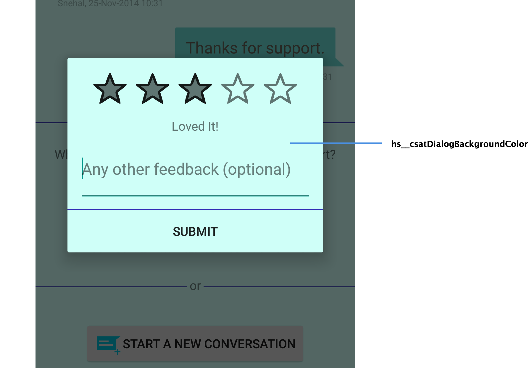
hs__attachScreenshotActionButtonIcon- used to indicate drawable icon for attach screenshoths__startConversationActionButtonIcon- used to indicate drawable icon for staring new conversationhs__searchOnNewConversationDoneActionButtonIcon- used to indicate drawable icon for 'done' in search result FAQ when showSearchOnNewConversation flag is set to true
Applicable to SDK v3.9.0 and above
hs__searchHighlightColor- used to change the color of highlighted text.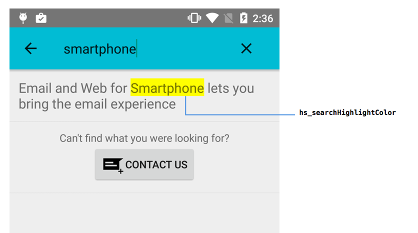
The above list of styleable attributes will continue to grow in the future depending upon SDK requirements.
For theming of Helpshift SDK v3.2.0 and below refer theming and skinning docs.
Theming - 2.8.x and above
You can refer to the following sample app which implements theme inheritance -
| HSThemeApp | show theming capabilities of the helpshift android sdk. |
Since SDK v3.5.0 and above, all the resource files have been moved to
a single file values.xml under- helpshift-android-sdk/res/values/values.xml.
The Helpshift Android SDK inherits theme styles from the parent set in
helpshift-android-sdk/res/values/hs__themes_base.xml file. As the
Helpshift SDK depends on the
v7 appcompat library,
this parent can be readily changed to -
@style/Theme.AppCompat.Light.DarkActionBar(Set by default)@style/Theme.AppCompat.Light@style/Theme.AppCompat
To set the Helpshift SDK to inherit from your app theme styles -
- Inside
helpshift-android-sdk/res/values/hs__themes_base.xmlchangeparentofTheme.Helpshift.Base - Rename
helpshift-android-sdk/custom_rules_helpshift.xmltohelpshift-android-sdk/custom_rules.xml - Inside
helpshift-android-sdk/project.propertiesset thehelpshift.res.parentvariable to the path to you projectres/folder containing the parent theme.
Additionally for 3.2.0 and above
- Inside helpshift-android-sdk/res/values/hs__colors.xml change the following colors to match your app's theme colors
        <color name="hs__actionBarTextColorPrimary">#F3F3F3</color>
        <color name="hs__actionBarTextColorSecondary">#000000</color>
- Inside helpshift-android-sdk/res/values/hs__themes.xml you can change the following -
hs__selectableItemBackground- Your Selectable Menu Item background style
        <item name="hs__selectableItemBackground">
          @drawable/hs__actionbar_compat_item
        </item>
- HSActionBarCompat (android:background) - Your ActionBar background drawable or color
        <style name="HSActionBarCompat">
          <!-- Action Bar background -->
          <item name="android:background">#222222</item>
        </style>
- If you are using themes which inherit from either AppCompat or ActionBarSherlock; add reference to these libs inside
helpshift-android-sdk/project.properties:
        android.library.reference.1=path/to/appcompat

    OR

            android.library.reference.1=path/to/actionbarsherlock

    **Please make sure the paths to the libs are relative paths.**
Skinning overview - 2.7.x and below
The Helpshift 2.7.x SDK for Android comes with two default themes. Viz.
HSThemeLightHSThemeDark
Each theme consists of three parts. For Example the HSThemeLight comprises the following components:-
hs_resources.xmlcontains the colors used in theHSThemeLighttheme and are prefixed withhs_light.hs_theme_light.xmlin res/values folder for pre-Honeycomb theme values.hs_theme_light.xmlin res/values-v11 folder for post-Honeycomb theme values.
Similarly, the colors used in HSThemeDark are prefixed with
hs_dark. The hs_resources.xml file also contains other resources
which are common to both themes. Example:- paddings, fonts and font
sizes etc. To apply a theme to any activity, simply change the
android:theme value for that activity in AndroidManifest.xml.
Theme structure - 2.7.x and below
hs_resources.xml- This file declares the reference attributes which are used to refer different styles depending on the theme applied. It also contains theme specific colors used in theHSThemeLightandHSThemeDark. Example:-<attr name="hs_activityHeaderStyleRef" format="reference"/>
...etc
<!-- Light theme colors -->
<color name="hs_light_header_background_color">#58759d</color>
...etc
<!-- Dark theme colors -->
<color name="hs_dark_header_background_color">#222222</color>
...etchs_theme_light.xml- This file contains a theme style named HSThemeLight which extends android themes styles. The HSThemeLight style contains the reference attributes previously declared inhs_resources.xml, which now refer corresponding styles depending on the theme in use. Here we can see that thehs_activityHeaderStyleRefattribute refers to the@style/hs_lightActivityHeaderStylestyle which is defined in the same file as follows.<style name="HSThemeLight" parent="@android:style/Theme.Light.NoTitleBar">
<!-- Attributes -->
<item name="hs_activityHeaderStyleRef">@style/hs_lightActivityHeaderStyle</item>
...etc
</style>
<style name="hs_lightActivityHeaderStyle">
<item name="android:background">@color/hs_light_header_background_color</item>
<item name="android:textColor">@color/hs_light_header_font_color</item>
</style>hs_theme_dark.xml- Similarly, this file contains the style for HSThemeDark which contains the same attribute declared in hs_resources.xml. However, this one points to a dark style. Here we can see that thehs_activityHeaderStyleRefattribute refers to the@style/hs_darkActivityHeaderStylestyle which is defined in the same file as follows.<style name="HSThemeDark" parent="@android:style/Theme.Black.NoTitleBar">
<!-- Attributes -->
<item name="hs_activityHeaderStyleRef">@style/hs_darkActivityHeaderStyle</item>
...etc
</style>
<style name="hs_darkActivityHeaderStyle">
<item name="android:background">@color/hs_dark_header_background_color</item>
<item name="android:textColor">@color/hs_dark_header_font_color</item>
</style>
Customizing Themes - 2.7.x and below
Themes can customized in two ways.
Changing color resources - You can either change the color resources directly in the
hs_resources.xmlfile for either a light or dark theme.Extend and define custom theme - You can extend one of the given themes and customize certain style attributes to refer your customized styles. These customized styles can use custom colors according to your new theme. Example:-
        <style name="HSThemeCustom" parent="style/HSThemeLight">
          <!-- Attributes -->
          <item name="hs_activityHeaderStyleRef">@style/hs_customActivityHeaderStyle</item>
          ...etc
        </style>
        <style name="hs_customActivityHeaderStyle">
          <item name="android:background">@color/hs_custom_header_background_color</item>
          <item name="android:textColor">@color/hs_custom_header_font_color</item>
        </style>
        ...etc


    You can preview these customizations in Eclipse by selecting the custom theme as shown.

    <Image src="/static/books/android/custom-theme-switch.jpg"  width="full" alt="custom-theme-switch.jpg" />
List of style references - 2.7.x and below
You can inspect the style references in Eclipse by opening a layout
file, double-cliking on the UI element and checking the
style="?hs_attributeName" attribute. Example:-

The following style references are declared in hs_resources.xml. These
refer to corresponding styles depending on the themes applied, as shown
above.
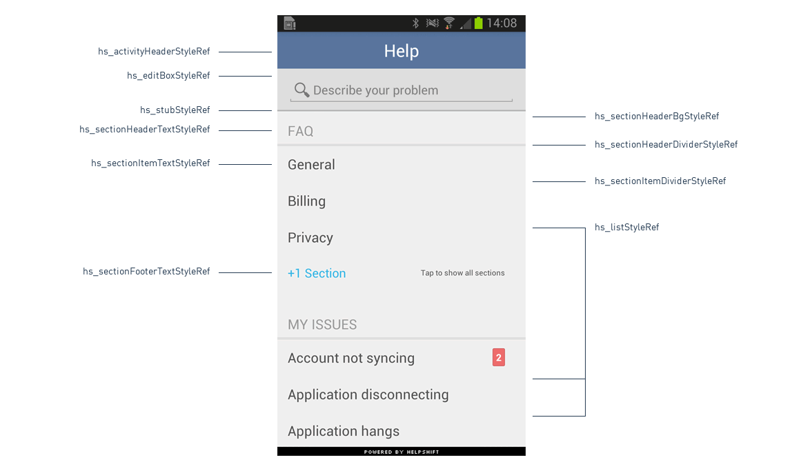
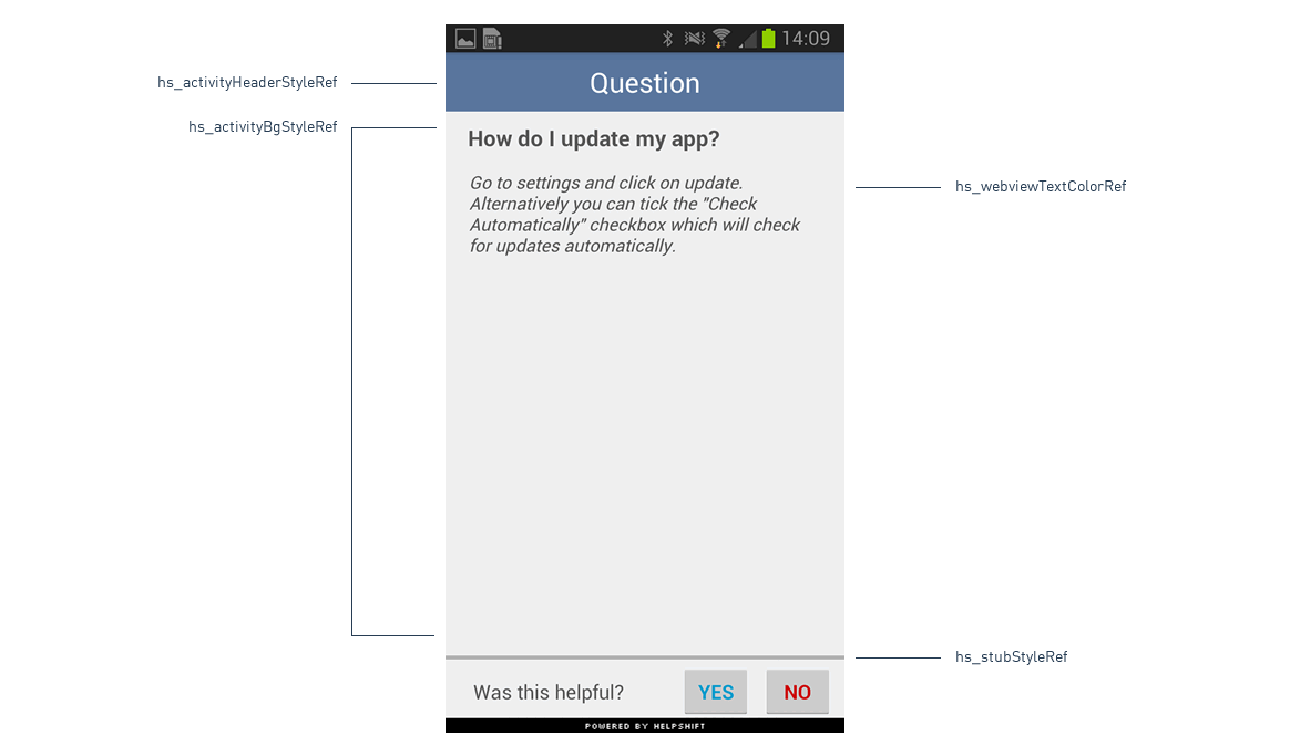
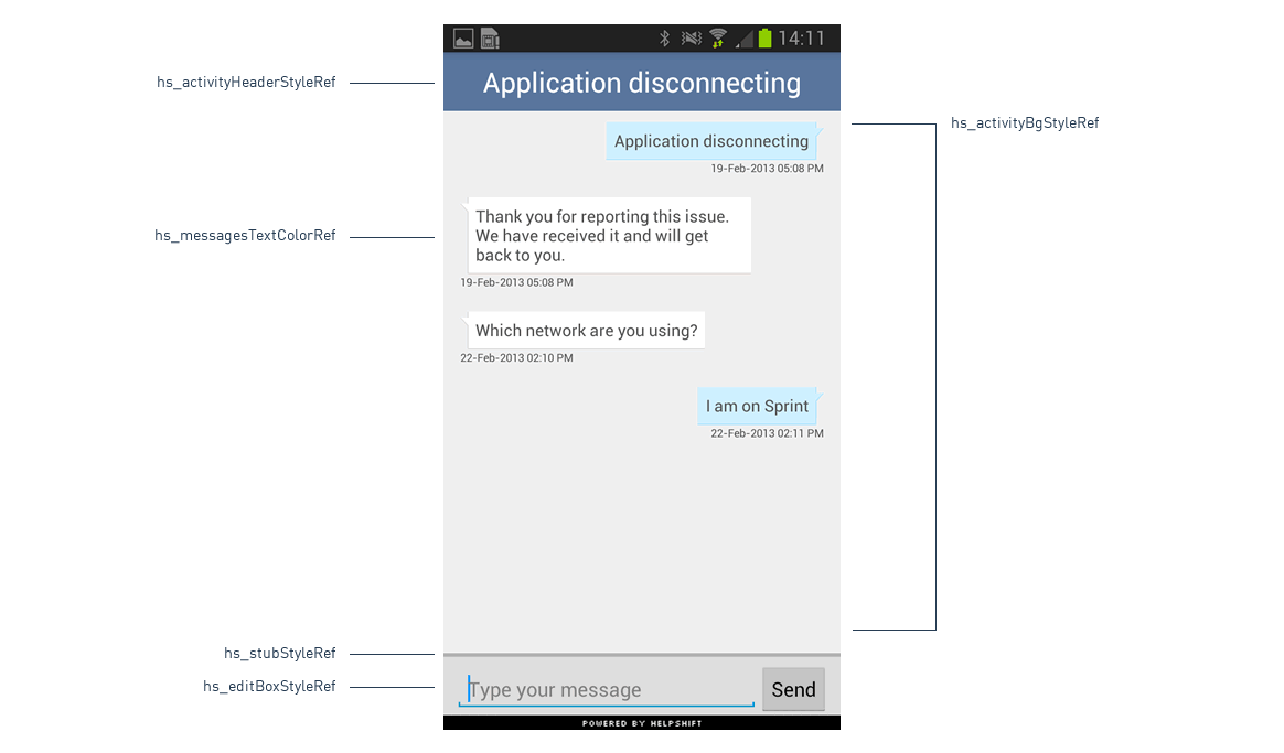
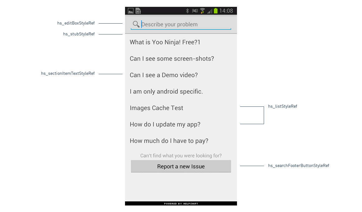
hs_sectionHeaderBgStyleRef- used to define the background color for section header.hs_sectionHeaderTextStyleRef- used to define the text style for section header.hs_sectionHeaderDividerStyleRef- used to define the color for the header divider.hs_sectionItemTextStyleRef- used to define the text styles for section items.hs_sectionItemDividerStyleRef- used to define the color for the section items divider.hs_sectionFooterTextStyleRef- used to define text color, font, size etc. for text in section footer.hs_searchFooterButtonStyleRef- used to define style for "Report a new Issue" button in the search screen.hs_messagesTextStyleRef- used to define the text style of all messages in chat. The color for messages inside chat bubbles is taken fromhs_messagesTextColorRefhs_activityHeaderStyleRef- used to define the header styles for all activities.hs_activityBgStyleRef- used to define the background of all activitieshs_listStyleRef- used to define the background color of the various list viewshs_stubStyleRef- used to define the horizontal stub color.hs_editBoxStyleRef- used to define the background color of the edit text boxes used for the search and chat.hs_messagesTextColorRef- used to define text color for messages inside chat bubble inHSMessagesactivity.hs_webviewTextColorRef- used to define the text color of the content of web view insideHSQuestionactivity.
- On the Settings page of the agent dashboard under the Apps tab you can find details of your added apps and additional configuration options for the SDK.