Tutorials
Tutorials
Skinning - Button appearance
For this example we will download the custom button appearances from Android Holo Colors. On the "Android Holo Colors"-page, change the "Color" and "Theme Name", select "Colored Button" and download the zip. For this example we have kept the theme name as the default "AppTheme".
The downloaded zip contains the following:-
drawable/- contains the selector resource which is the multi-state drawable for different button states.drawable-hdpi/,drawable-mdpi/anddrawable-xhdpi/- contains the various drawable images for the different button states.values/andvalues-v11/- contains theapptheme_style.xmlwhich defines the new button style. This folder also contains theapptheme_theme.xmlfile, which we do not use as we have out own theme xml.
The new button styles can be applied as follows:-
- To apply the new button style globally for a particular theme. (Inside
one of the theme files. Example:-
hs_theme_light.xml)
<style name="HSThemeLight" parent="@android:style/Theme.Holo.Light.NoActionBar">
<item name="android:buttonStyle">@style/ButtonAppTheme</item>
<!-- Attributes -->
<item name="hs_sectionHeaderBgStyleRef">@style/hs_lightSectionHeaderBgStyle</item>
...etc
</style>

- To set the button style for the "Search List Footer" button.
<style name="hs_lightSearchFooterButtonStyle" parent="@style/ButtonAppTheme">
<item name="android:text">@string/hs_report_issue_btn</item>
</style>

The above edits should be made for both the theme files under `values/` and `values-v11/`. Similarly, these edits can be applied to dark themes in `hs_theme_dark.xml`.
Skinning - Chat bubble 9-patch
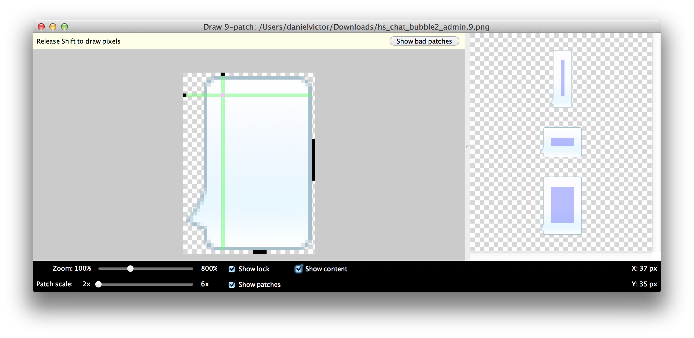
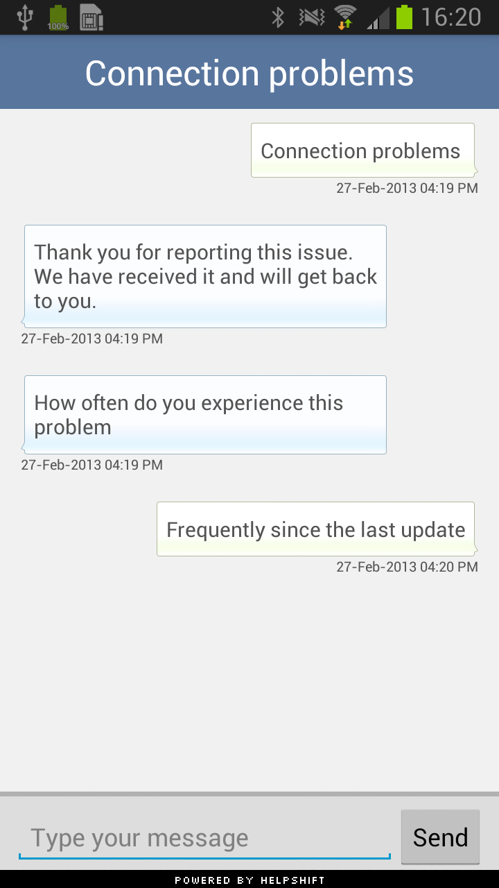
The two 9-patch images used for the chat bubbles inside the helpshift SDK are named:-
hs_chat_bubble_admin.9.png- used to render messages from the agenths_chat_bubble_user.9.png- used to render messages from the user
To learn more about 9-patch images refer to this article on Android Developers.


Skinning - Tiled backgrounds
Copy the image files for the tiled background to your ldpi, mdpi, hdpi
and xhdpi drawable folders.
res/drawable-ldpi/hs_background.png
res/drawable-mdpi/hs_background.png
res/drawable-hdpi/hs_background.png
res/drawable-xhdpi/hs_background.png
Create a xml under the drawable folder called hs_bg.xml, defining
the bitmap drawable resource used for the tiled background.
<?xml version="1.0" encoding="utf-8"?>
<bitmap
    xmlns:android="http://schemas.android.com/apk/res/android"
    android:src="@drawable/hs_background"
    android:gravity="center"
    android:tileMode="repeat" />
You can now use this resource for defining the the android:background
attribute for various styles inside the theme files.
- To use this drawable as a activity background, you could do the following:
<style name="hs_lightActivityBgStyle">
<item name="android:background">@drawable/hs_bg</item>
</style>
And set all list backgrounds to transparent:
<style name="hs_lightListStyle">
<item name="android:background">@android:color/transparent</item>
</style>

- To set the activity header background:
<style name="hs_lightActivityHeaderStyle">
<item name="android:background">@drawable/hs_bg</item>
<item name="android:textColor">@color/hs_light_header_font_color</item>
</style>

- To set the section header background:
<style name="hs_lightSectionHeaderBgStyle">
<item name="android:background">@drawable/hs_bg</item>
</style>

In the above example we have changed the backgrounds inside the light
theme. This can also be used for making similar changes inside the dark
themes. Be sure to make these changes in both `values/` and `value-v11/`
theme files.