Skinning & Customization
Customize the Helpshift SDK to completely match the look and feel of your app.
Using UIAppearance
UIAppearance customisations are applied to Helpshift SDK by default. However if there is a conflicting property, then the value in HelpshiftConfig.plist will take precedence.
For example: If the app uses UIAppearance to change the colour of Navigation Bar title and also specifies a colour for the same property in the HelpshiftConfig.plist file, then the value in plist will be used. In order to use the UIAppearance value, the app must leave the corresponding entry in the plist blank.
Introduction
Head over to Theming and Skinning if you want to customize your SDK integration's typeface, colors or background images. It is done via simple key-value pairs in a plist file.
If you want to change strings used in the SDK's UI or want to translate them as per device language, see String Customization.
Theming and Skinning
Default Skinning Configurations
Helpshift comes with four default skinning configurations -
- Light -
HSThemes/HelpshiftConfig.plist - Dark -
HSThemes/HelpshiftConfigDark.plist - Light High Contrast -
HSThemes/HelpshiftConfigHighContrast.plist - Dark High Contrast -
HSThemes/HelpshiftConfigDarkHighContrast.plist
Customized Skinning Configurations
Helpshift SDK allows following ways to customize the theme:
Runtime Theme Changes
If your app allows users to change theme at runtime (for eg using a Theme Change menu or Dark Mode switch), Please use the following APIs
If your app wants to change both light and dark themes at runtime, use the following API:
static void setThemes(const char *lightThemeFileName, const char *darkThemeFileName);
This API supports OS level Dark Appearance toggle to switch between the two provided themes, You can specify both light and dark variants of your custom Helpshift theme and Helpshift SDK will switch themes as per OS level theme.
Steps to follow:
- Navigate to the
HelpshiftCustomThemesfolder. - Make a copy of
HelpshiftCustomConfig.plistand rename it to your preferred name, for egHelpshiftCustomLightConfig.plist. - Make desired changes in your custom file
HelpshiftCustomLightConfig.plistfile. For details, refer to the Guide - Add this file to your project's bundle resources. Go to Build Phases → Copy Bundle Resources → Add the file using + icon.
- Similarly make a copy of
HelpshiftCustomConfigDark.plist. - Make desired change in your custom file
HelpshiftCustomDarkConfig.plistand add it your project instructions mentioned in step 3 - Call
HelpshiftCocos2dx::setThemes(lightThemeFileName, darkThemeFileName)API anytime after the SDK is initialized
Example Code
HelpshiftCocos2dx::setThemes("HelpshiftCustomLightConfig", "HelpshiftCustomDarkConfig");
- Light and Dark Appearance switching works only if your app is built with Xcode 11 or above.
- You can pass null to reset the theme to default SDK theme for that param.
- If value of any of the passed parameter is invalid, i.e. your application's main bundle does not contain a plist file with that name, the API will behave as no-op.
- The automatic switching will only work on iOS 13 and above, on older versions SDK will use light theme by default, you can use setTheme API to specify the theme on older versions.
- The enableAutomaticThemeSwitching config flag is ignored when this API is used and SDK will use the provided themes for Light and Dark Appearances respectively.
If your app does not support Dark Appearance and uses same theme irrespective of the OS Appearance, use the following API:
static void setTheme(const char *themeFileName);
Steps to follow:
- Navigate to the
HelpshiftCustomThemesfolder. - Make a copy of
HelpshiftCustomConfig.plist. - Make desired changes in your custom file
HelpshiftCustomConfig.plistfile. For details, refer to the Guide - Add this file to your project's bundle resources. Go to Build Phases → Copy Bundle Resources → Add the file using + icon.
- Call
HelpshiftCocos2dx::setTheme(themeFileName)API anytime after the SDK is initialized.
Example Code
HelpshiftCocos2dx::setTheme("HelpshiftCustomConfig");
- You can pass null to reset the theme to default SDK theme for that param.
- If value of the passed parameter is invalid, i.e. your application's main bundle does not contain a plist file with that name, the API will behave as no-op.
- The enableAutomaticThemeSwitching config flag is ignored when this API is used and SDK will use the provided theme for both Light and Dark Appearances.
Compile time Theme Changes
If your app does not change theme on runtime, Please read the below documentation:
If your app supports Dark Appearance in iOS 13
Helpshift SDK bundles themes for light and dark mode out of the box but leaves the decision to enable dark mode switching to the application developers. You can enable automatic switching of Helpshift SDK theme using enableAutomaticThemeSwitching flag.
If you turn this flag on, Helpshift SDK will use HelpshiftConfig.plist theme when device is in light mode and will use HelpshiftConfigDark.plist when the device is operating in Dark Appearance.
If you want to customize the skinning attributes of the Helpshift SDK, there are 2 options:
- Navigate to the
Helpshift.framework. - Copy the
HelpshiftConfig.plistfile asHelpshiftCustomConfig.plistand copy theHelpshiftConfigDark.plistfile asHelpshiftCustomConfigDark.plist. - Make sure both files are present in the
HSThemesfolder. - Change the values in the
HelpshiftCustomConfig.plistandHelpshiftCustomConfigDark.plist.
Helpshift SDK will first look for the HelpshiftCustomConfig.plist file in the Application's main bundle.
If it fails to find such a file, it will look for the HelpshiftConfig.plist file in the Helpshift SDK's bundle.
If your app does not support Dark Appearance in iOS 13
Helpshift SDK by default uses HelpshiftConfig.plist file for skinning the SDK. You can change the plist values for theme elements that you want to customize in HelpshiftConfig.plist. For details, refer to the Guide
If you want to customize the skinning attributes of the Helpshift SDK, there are 2 options:
- Navigate to the
Assets/Helpshift/Plugins/iOS/HSThemesfolder. - Copy the
HelpshiftConfig.plistfile asHelpshiftCustomConfig.plistin the sameHSThemesfolder. - Change the values in the
HelpshiftCustomConfig.plist.
Helpshift SDK will first look for the HelpshiftCustomConfig.plist file in the Application's main bundle.
If it fails to find such a file, it will look for the HelpshiftConfig.plist file in the Helpshift SDK's bundle.
We'll now walk through each group of customizations -
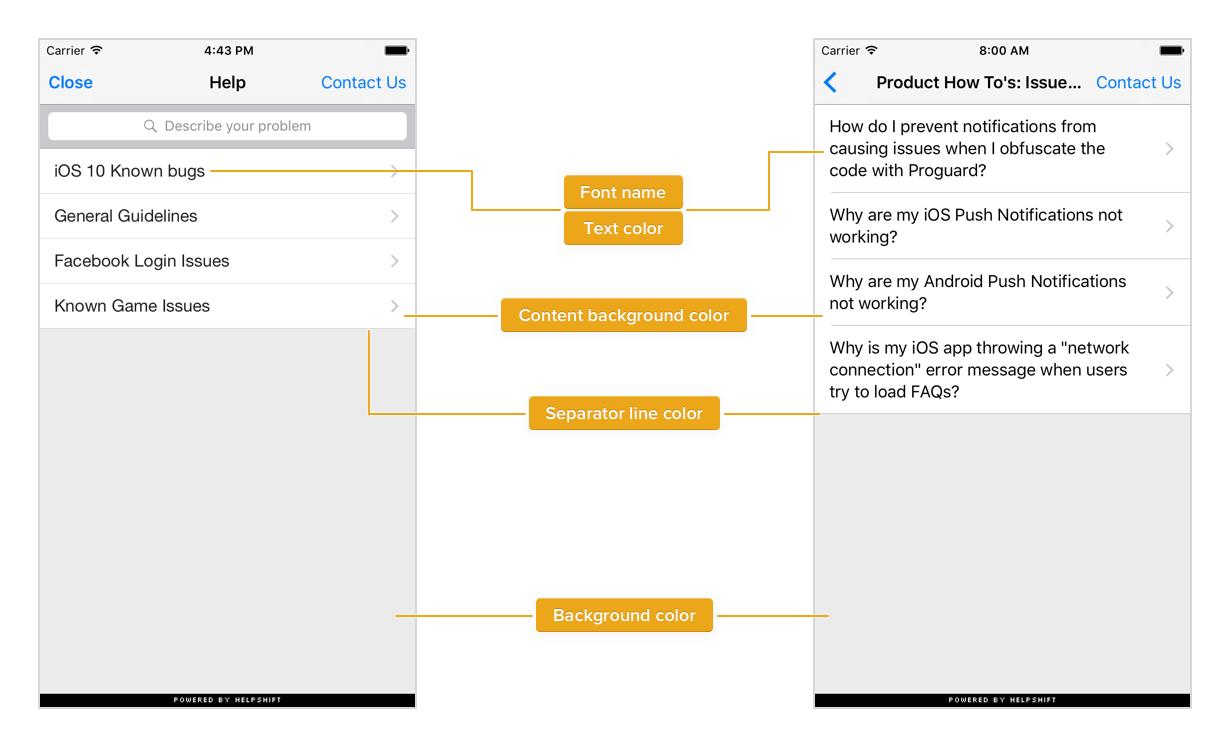
Global Attributes
These attributes control the looks of in-app support over many screens.
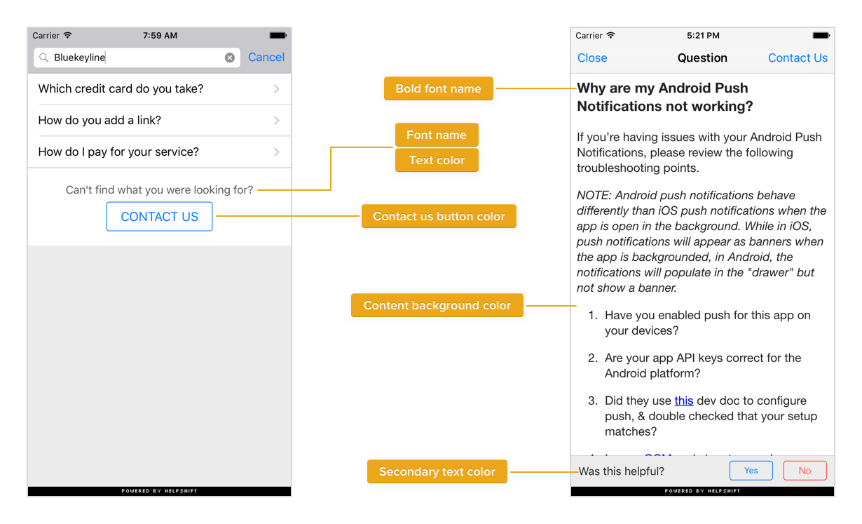
| Font name | Global font face - applies to texts for sections list, FAQ list, FAQ answer, search results. |
| Bold font name | Applies to FAQ section headers on support screen and FAQ question |
| Background color | Applies to regions with no UI elements or content. E.g. spaces around table views, FAQ section headers. |
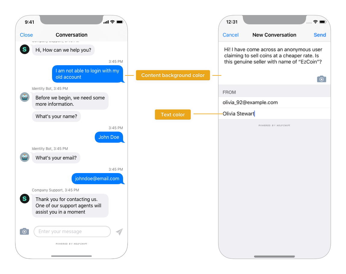
| Content background color | Background color for content - table cells, single FAQ screen, conversation screen. |
| Separator line color | Separator color for table views - search results, section & faq lists. |
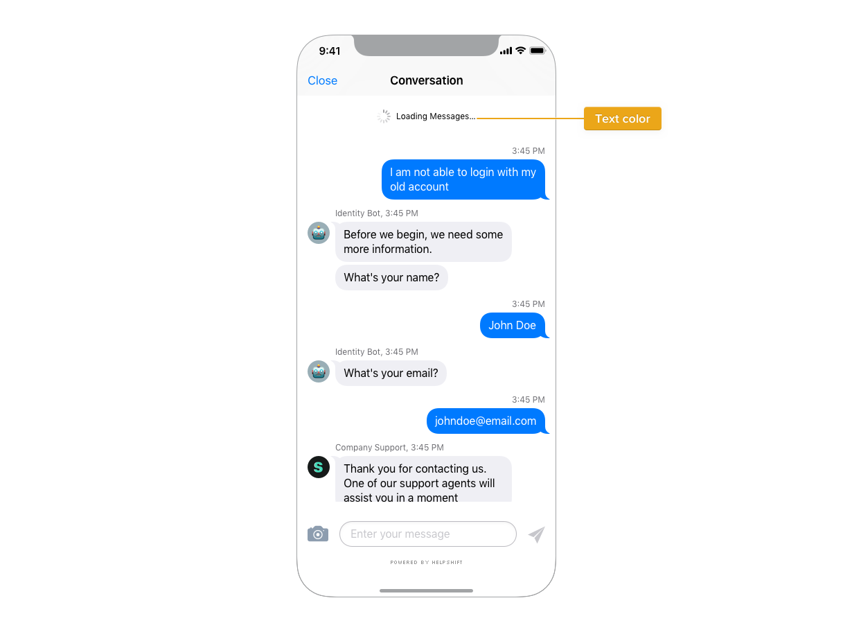
| Text color | Applies to text color for table cells, FAQ answer & search results. |
| Secondary text color | Applies to text color of footers, attachment info, conversation ended message and ratings. |
| Placeholder text color | Applies to text color of all the place holders like Name, email fields etc in the SDK. |
| Contact us button color | Applies to "contact us" button below search results |
| Cell selection color | Applies to tableview cells. Sets the cell selection color. |
| Search highlight color | Highlight the search result with specified colour. |
| Status bar light content | Specify wether the status bar needs to use light content mode. Use only if you have ViewController based StatusBar appearance. |
| Table view cell extra vertical padding | Provide custom padding for cell row height. Valid values are between 0 and 100 (included). |
| Hide back button label | Hides the text for back button. |
| Table view max lines | Sets the max number of lines to be shown in a section, an FAQ and or search lists. If the text exceeds this value, the last line will be ellipsized. |
| Font file name | The file name of the font to be used for displaying the FAQ body. |
| Bold font file name | The file name of the font to be used for displaying the FAQ title. |
| Table view disclosure color | The color of the disclosure indicator in the inbox table view. |
| Notification banner color | The background color of notification banner |
| Notification banner title color | The text color of the title in notification banner |
| Notification banner subtitle color | The text color of the subtitle in notification banner |
Association of "Global Attributes" to UI elements -
Header background and layering
Background for section headers is transparent, hence it inherits from Background color in Global Attributes -
Support UI Overview
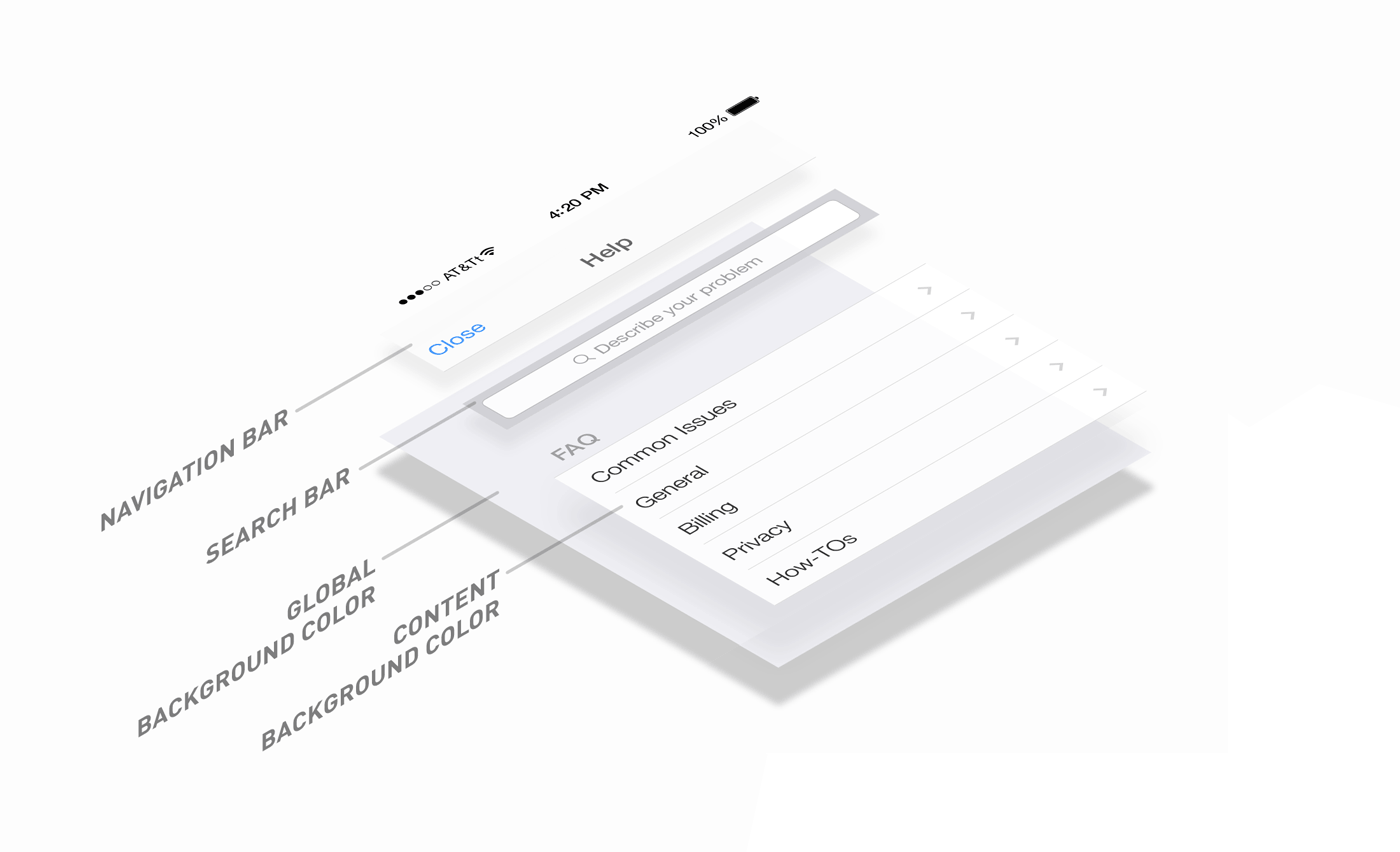
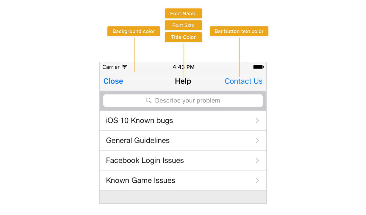
Navigation Bar
| Font name | Font face used for navigation bar title |
| Font size | Font size of navigation bar title. It's a unitless number, e.g. 20. |
| Title color | Color for navigation bar title |
| Bar button text color | Text color for navigation bar buttons |
| Background color | Applies to navigation bar's background |
| Bar button font name | Font name for navigation bar button. |
| Bar button font size | Font size navigation bar button. |
| Set Translucent | Translucent property for navigation bar. It's a boolean value. |
Search Bar
| Bar style (iOS 11 and above) | Style for the search bar text field on iOS 11 and above. Valid values are "Default" and "Black". |
| Background color | Background color for search bar. |
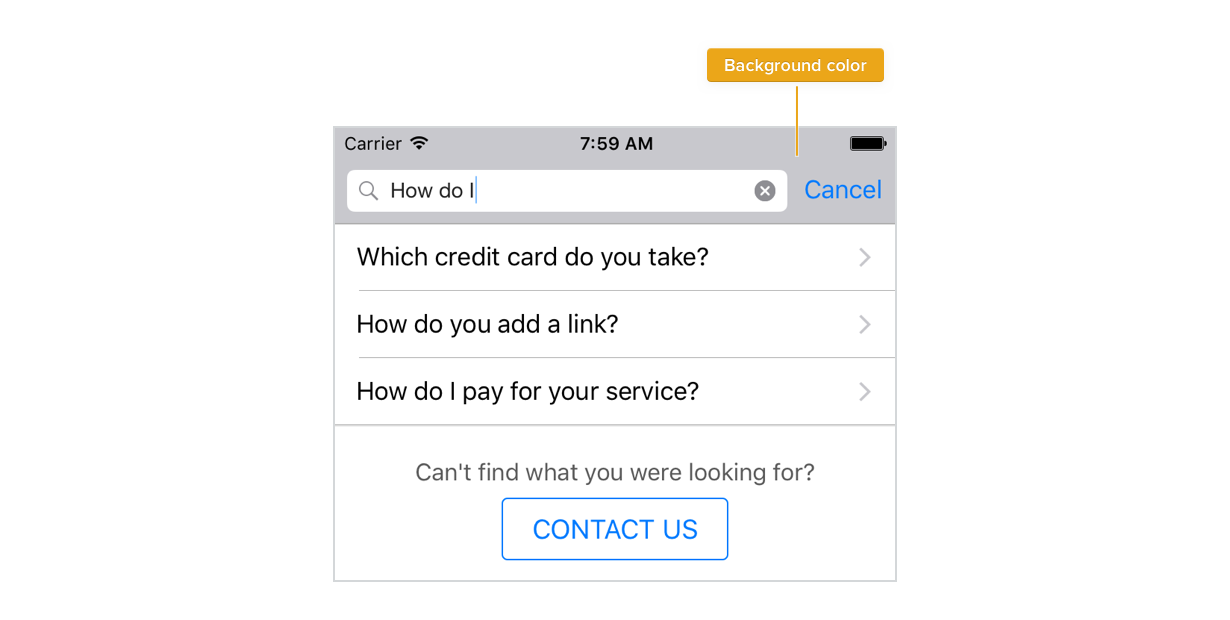
While iOS allows developers to set a background color on search bars, it forbids one from controlling the Cancel button's color. While Apple may fix this soon, we're aware of this and are working on ways around this issue. You should avoid complete white (FFFFFF), and lighter shades for the "Background color" attribute so that Cancel button remains easily visible.
Starting from iOS 11, search bar is part of the navigation bar. So this attribute has no effect on iOS 11 and later. The color of the whole navigation bar, including the search bar, can be changed using the "Background color" attribute of navigation bar
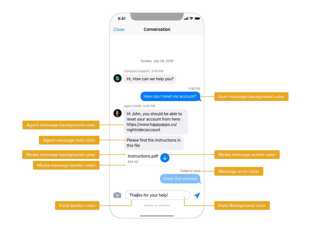
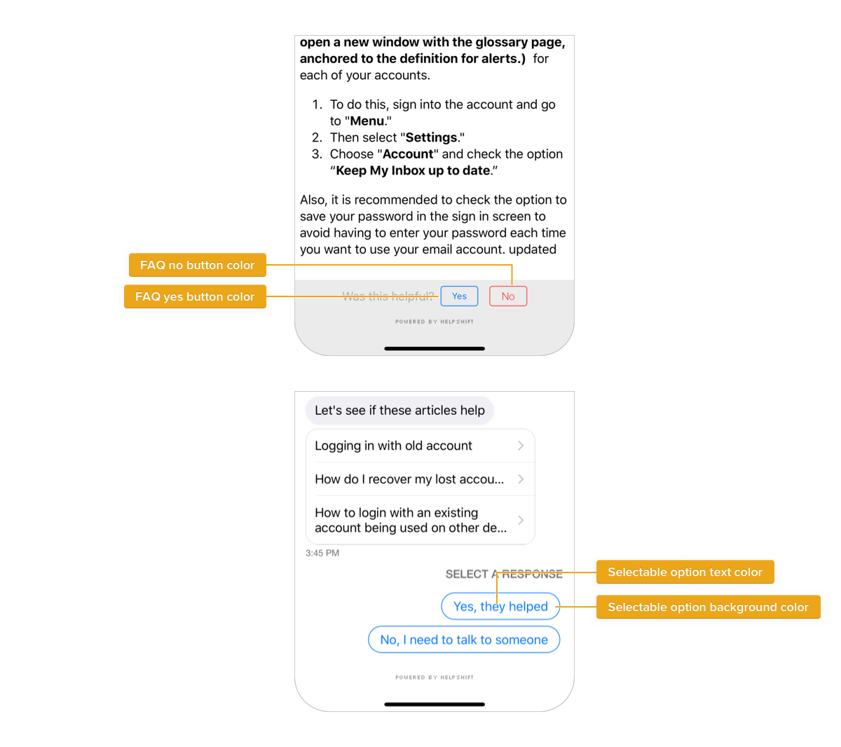
FAQ and Chat
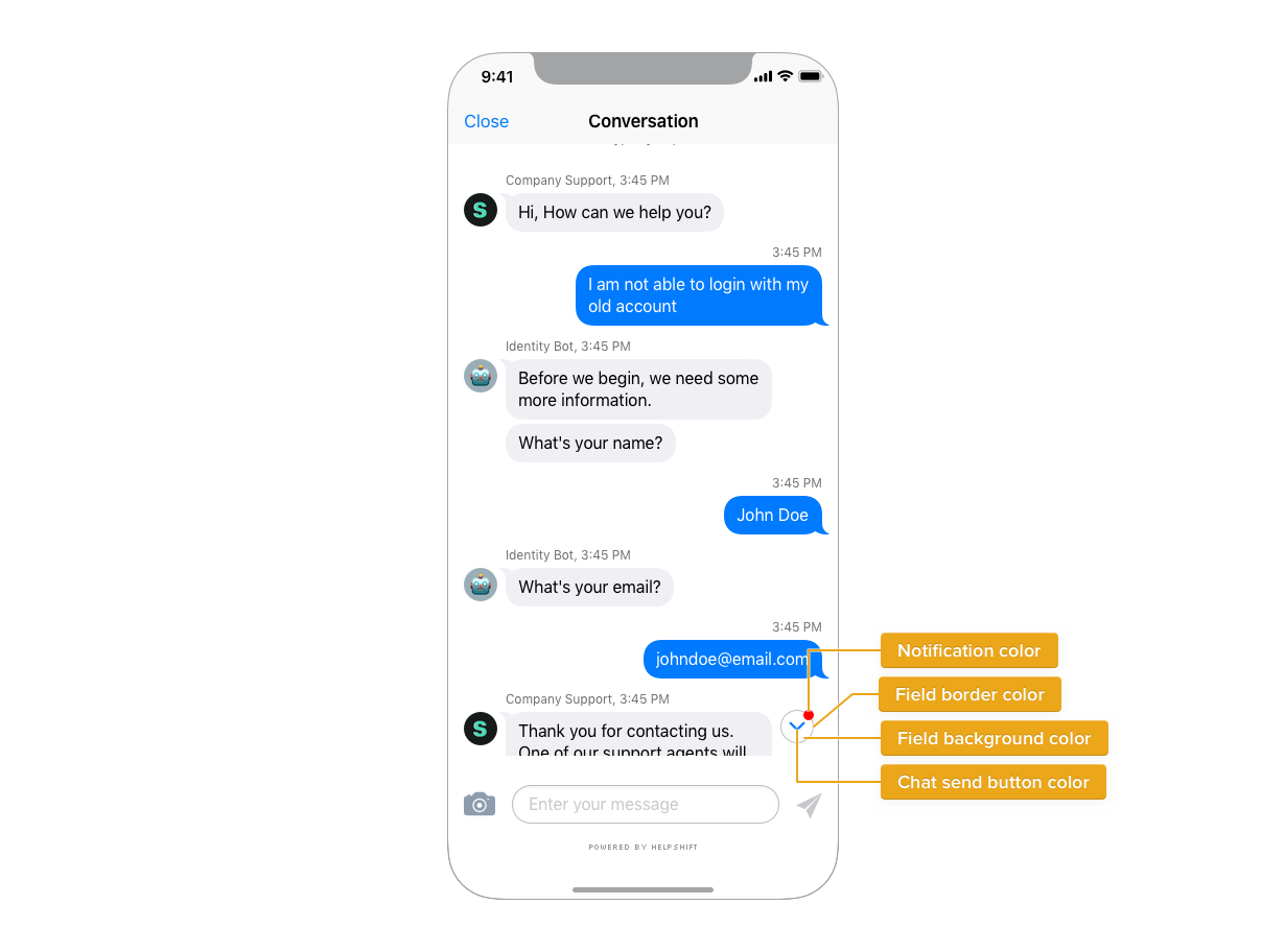
| Chat send button color | Color for send button on conversation chat screen. |
| Timestamp text color | Applies to the chat Timestamps in the SDK. |
| FAQ yes button color | Color for FAQ helpfulness choice "YES" |
| FAQ no button color | Color for FAQ helpfulness choice "NO" |
| Screenshot tutorial button color | Color for screenshot request tutorial button and back button in screenshot tutorial |
| Screenshot attach button color | Color for screenshot request attach button and take screenshot button in screenshot tutorial |
| Media message background color | Color of the background shown in the attachment message or QuickSearch Bot FAQs message bubble. |
| Media message border color | Color of the border shown in the attachment message bubble. |
| Media message action color | Color for the action button in the media message. |
| Message error color | Color of the error thrown for a message. |
| User message text color | Color for the text in the user chat bubble |
| Agent message text color | Color for the text in the agent chat bubble |
| User message background color | Color for background of the user chat bubble. |
| Agent message background color | Color for background of the admin chat bubble. |
| Typing indicator color | Color for the dots shown in the typing indicator |
| Selectable Option Text Color | The color of the text in option pills of the QuickSearch Bot or skip button. |
| Selectable Option Background Color | The background color of the option pills of the QuickSearch Bot or skip button. |
| Selectable Option Border Color | The border color of the option pills of the QuickSearch Bot or skip button. |
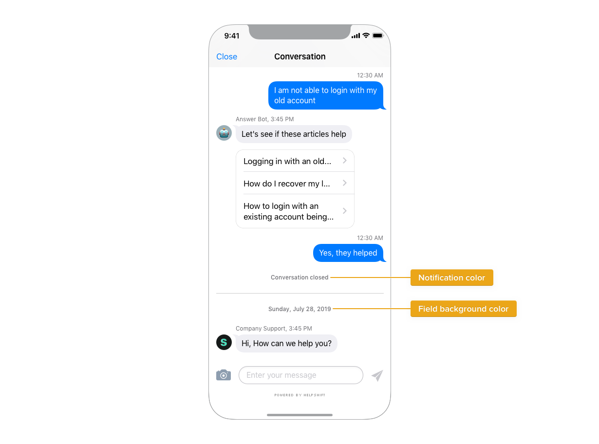
| Field Background color | The background color of the reply field. |
| Field border color | The border color of the reply field. |
| Notification color | Color of the dot indicator on the 'jump' button to indicate there are new messages. |
| Links in FAQ Color | Color of the links inside FAQs. |
Message Retry Badge
A retry badge is shown on messages in conversation screen, that fail to reach customers.
| Text color | Color for the exclamation mark (!) on message retry badge. |
| Background color | Retry badge's background color |
Conversation Resolution
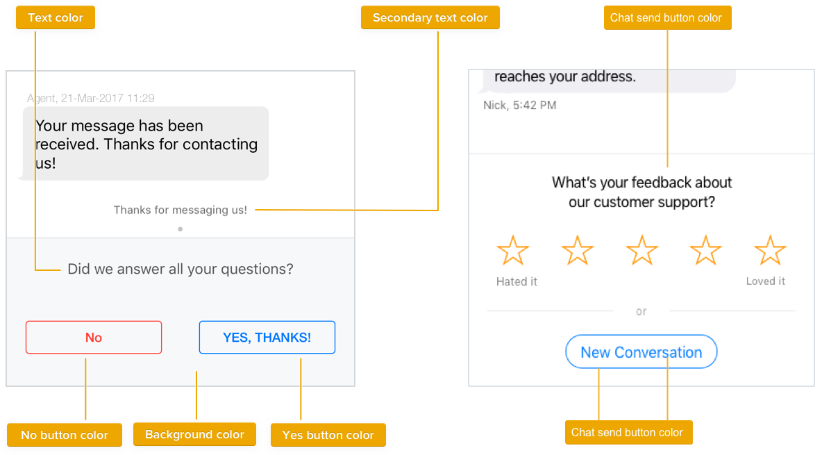
| Background color | Background color for conversation resolution footer |
| Text color | Color for labels on conversation resolution footer |
| Rating star color | Color for rating stars when customer satisfaction survey is enabled |
| Yes button color | Color for confirmation button "YES" |
| No button color | Color for confirmation button NO" |
Jump Button
| Notification color | Color of the dot indicator on the 'jump' button to indicate there are new messages. |
Using Custom Fonts
Step 1: Add the font to your project. Edit your app's plist file <App-name-Info.plist> and add a key "Fonts provided by application" to it. Under the key, list out file names of all the fonts you want to use in your app and in support. If you've already listed such fonts, skip this step.
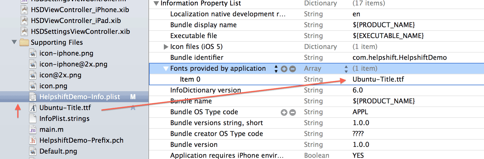
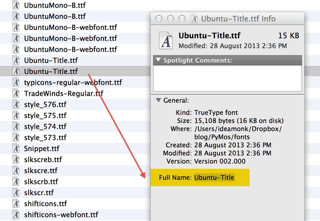
Step 2: Copy the font's full name. To do this, select the font in Finder and hit Command ⌘+I (Get Info).
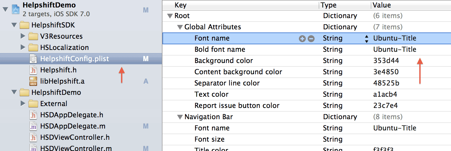
Step 3: Paste the font name into HelpshiftConfig.plist, wherever necesary
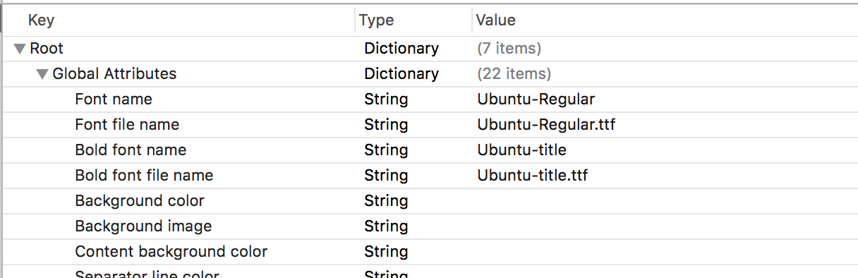
Starting 1.6.0, if you need to apply font name and bold font name to Single FAQ screen, you need to add the font file name and bold font file name in HelpshiftConfig.plist
Step 4: Test the font in simulator. Errors in font names are ignored by the SDK —
Orientation support
The iOS SDK will follow the orientation, that the application supports in plist file.
Troubleshooting
If you are having issues with skinning the SDK, head over to the Troubleshooting section for further information.