String Customization
Important
Helpshift’s Legacy SDKs (SDK Version <=7.x.x) reached their end of life on 31 Dec 2022, and end of support on 31 March 2023. Please upgrade to the Latest SDKif you haven't already.
Customize all the strings in Helpshift SDK's user interface
Starting from version 1.3.0, Helpshift now uses the HSLocalization bundle to read the default values of all the string translations.
You can customize all the strings used in the Helpshift SDK by following the below steps.
- Create a
HelpshiftCustomLocalizationbundle file and add it into your Application. The access path for this bundle will be :path-to-main-bundle/HelpshiftCustomLocalization.bundle. - Copy the lproj files which you are interested in supporting from the HelpshiftCustomLocalizations folder which ships with the Helpshift SDK zip file.
- Add the lproj files selected in the previous step and add those to the HelpshiftCustomLocalization bundle.
- Change translations of the relevant keys in the HelpshiftLocalizable.strings files.
Below is the description of the keys (in the
HelpshiftLocalizable.strings file) for each of the customizable strings
in the app:
| Can't find what you were looking for? | Text that shows below search when no FAQs are found. This show up if enableContactUs option is set to NO 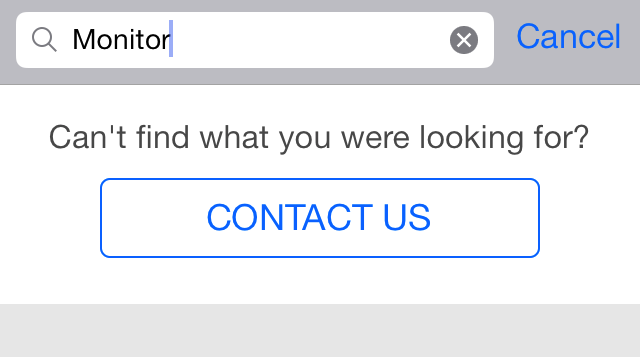 |
| Thanks for contacting us. | Text for alertview when customer is dropped back to app after starting a conversation 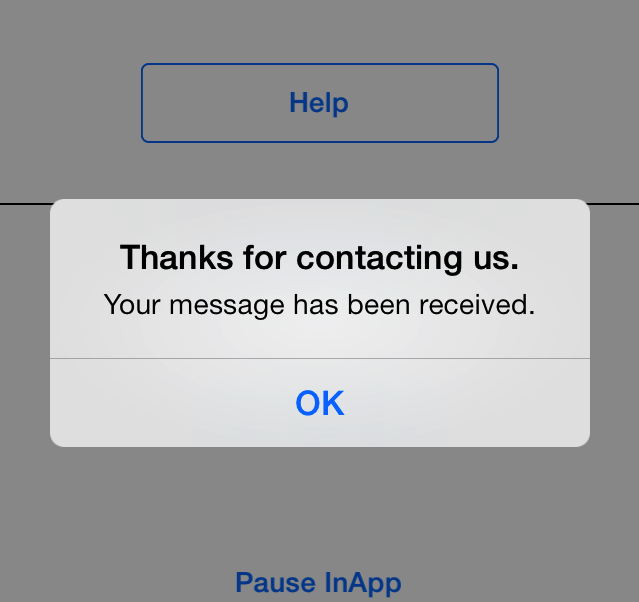 |
| Your message has been received. | Text for alertview when customer is dropped back to conversation chat view after starting a conversation Message send failure. |
| Message send failure. | Title for alertview that shows when starting new conversation was not successful 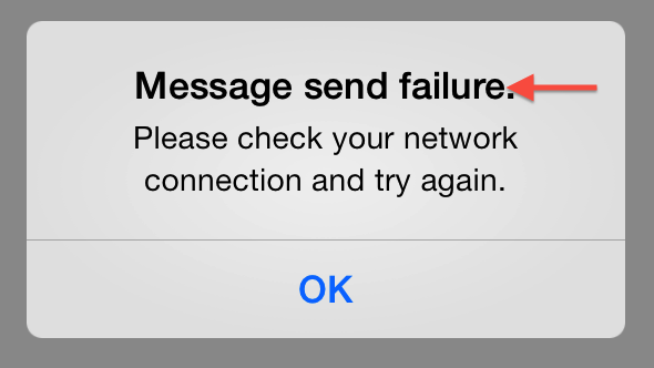 |
| Hated it | Text shown to hint 1 star rating. |
| Disliked it | Text shown to hint 2 star rating. |
| It was ok | Text shown to hint 3 star rating. |
| Liked it | Text shown to hint 4 star rating. |
| Loved it | Text shown to hint 5 star rating. |
| What's your feedback about our customer support? | Text shown in the customer satisfaction survey dialog. |
| Take a screenshot on your iPhone | Title for tutorial explaining how to take screenshot on the iPhone 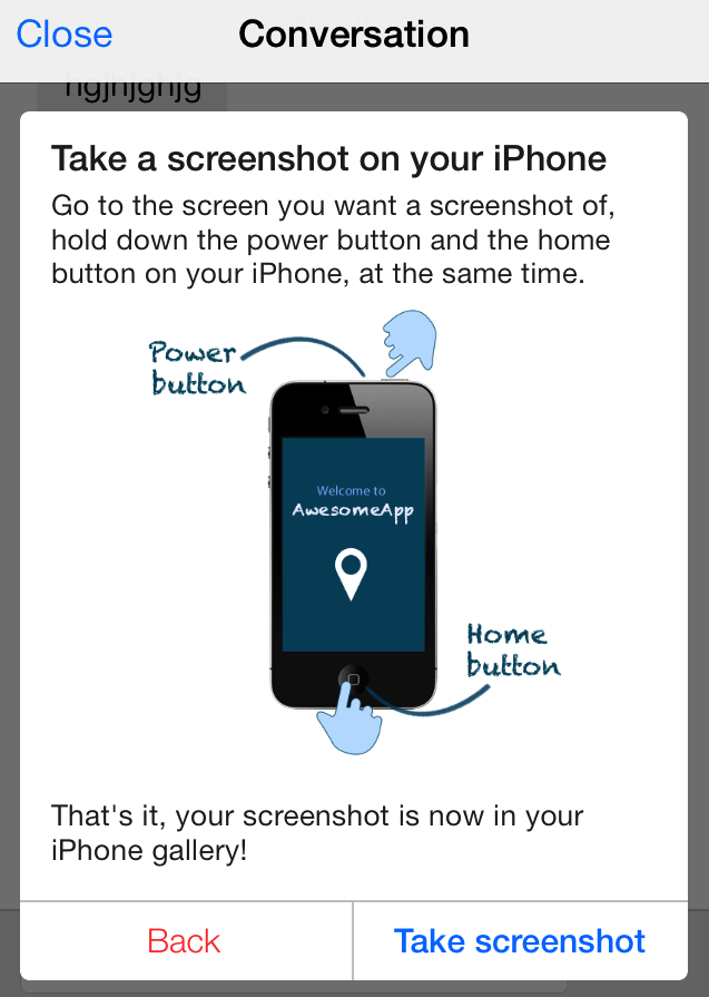 |
| Learn how | Text for the button in the screenshot widget that shows the user how to take a screenshot |
| Take a screenshot on your iPad | Title for tutorial explaining how to take screenshot on the iPad 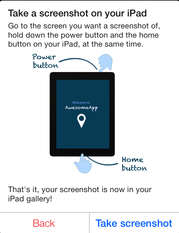 |
| SEND ANYWAY | Title for send button shown below suggestions when enhance ticket avoidance is enable. |
| Help | Text for the title of main support screen |
| Send message | Accessibility label for button to send message on chat screen |
| REVIEW | Review button text for the conversation screen review widget to review app |
| Close Help | Accessibility label for button to close FAQs screen opened via showFAQs API |
| New Conversation | Text for new conversation button in the confirmation panel |
| Please check your network connection and try again. | Message for alertview that shows when starting new conversation was not successful |
| New message from Support | Title for a new in-app notification with one reply on a conversation |
| Question | Title for navigation bar for single faq screen |
| No FAQs found in this section | Text for no faqs in section when FAQs list for a particular section is empty |
| Email (optional) | Placeholder text for email in new conversation screen (email is optional) |
| CONTACT US | Contact button that tails search results and contact button in the navigation bar. When used in navigation bar, it is turned to camel case. |
| Placeholder text for user's email in new conversation screen only when email is required. | |
| Sending your message... | Text for the progress hud that is shown when user starts a new conversation |
| Tap here if this FAQ was not helpful to you | Accessibility label for button to mark a FAQ unhelpful in single FAQ screen |
| Any other feedback? (optional) | Placeholder for textview, for user feedback on customer service. |
| You found this helpful. | Feedback text for mark helpful button in single faq screen. 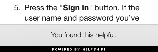 |
| No working Internet connection is found. | Message for the alertview that indicates absence of internet connection |
| Please enter a brief description of the issue you are facing. | Message for alertview that shows up if the user left description field blank or enters non-alphanumeric characters only. This is a slight attempt to prevent the user from entering gibberish |
| Did we answer all your questions? | Text shown for issue resolution dialog. |
| Close Section | Accessibility label for close FAQ section opened via showFAQSection API |
| Close FAQ | Accessibility label for close FAQ opened via showSingleFAQ API |
| Close | Generic Close, applies to close button in the navigation bar. |
| Send it anyway | Accessibility label for send button shown below suggestions when enhance ticket avoidance is enable |
| Back | Accessibility label for back button when a sub-intents list is opened |
| Service Rating | Title for the navigation bar, when the user gives their feedback on customer service. |
| Thanks for messaging us! | Footer text for messages indicating issue resolution. |
| Could not fetch faqs | Text for alertview that shows when FAQs list could not be fetched |
| Thanks for rating us. | Title for alertview, when the user submits a feedback on customer service. |
| Please enter a valid email address | Error text message visible when user enters an invalid email address in landscape mode |
| or | Separator text, shown between the customer satisfaction dialog, and start a new conversation dialog. |
| No | Mark unhelpful button in single FAQ screen |
| Stars | Accessibility label for 2 or more stars rating button |
| Preview | Title for navigation bar for image preview screen. |
| Type in a new message | Accessibility label for reply footer on chat screen |
| No Internet! | Title for the alertview that indicates absence of internet connection |
| You didn't find this helpful. | Feedback text for mark unhelpful button in single faq screen. 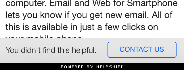 |
| Tap here if you found this FAQ helpful | Accessibility label for button to mark a FAQ helpful in single FAQ screen |
| Star | Accessibility label for 1 star rating button |
| IssueDescriptionMinimumCharacterLength | Minimum number of characters user needs to type before he can send a message in Conversational issue-filing or start a new Conversation in Form-based issue-filing experience. |
| Was this helpful? | Text that shows below every single faq to mark the faq as helpful or unhelpful. 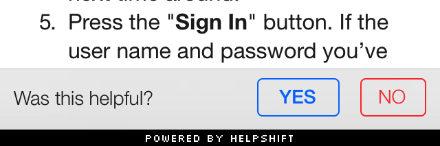 |
| OK | Generic OK, applies to attach screenshot |
| Suggestions | Title for navigation bar for search results when enhance ticket avoidance is enable. |
| No FAQs found | Text that shows below search when no FAQs are found for showFAQs: 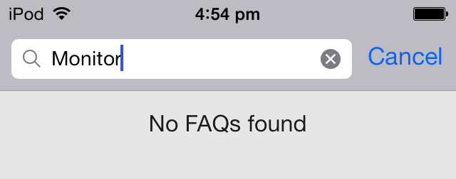 |
| Done | Navigation item to dismiss single FAQ view after the user has finished reading the suggested FAQ. |
| Cancel | Title for the actionsheet button to cancel the actionsheet. This action sheet shows when user selects the red exclamation icon beside an unsent message |
| Would you like to review the app? | Message for review request sent by Agent. |
| Try Again | Title for the actionsheet button to try sending a message again. This action sheet shows when user selects the red exclamation icon beside an unsent message |
| %d new messages from Support | Body for a new in-app notification with multiple replies on a conversation |
| Your Name | Accessibility label for name field in form based issue filing screen |
| Please provide a name. | Message for alertview that shows when the user does not enter a name in the user/email entry screen |
| What else can we help you with? | Auto-response message when the solution is rejected by the user in a conversation 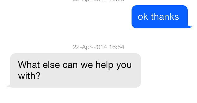 |
| Describe your problem | Placeholder text for FAQ search |
| How can we help? | Placeholder for problem description in new conversation screen |
| Help about | Accessibility label for FAQs and FAQ sections list |
| We could not fetch the required data | Text for alertview that shows when SDK fails to fetch FAQs |
| Name | Placeholder for name field in form based issue filing screen |
| Loading... | Generic Loading text for progress hud while fetching FAQs |
| Attach a photo | Accessibility label for button to attachment an image in form based issue filing screen |
| Yes | Mark helpful button in single faq screen |
| Your email(optional) | Accessibility label for email field in form based issue filing screen |
| Conversation | Title of the conversation screen |
| Questions that may already have your answer | Header for suggestions after new conversation when enhance ticket avoidance is enable. |
| Remove attachment | Accessibility label for button to cancel attachment in form based issue filing screen |
| Sorry! This conversation was closed due to inactivity. Please start a new conversation with our agents. | Text shown on chat screen when an issue gets archived |
| Ok, Attach | Text for the button in the screenshot widget that takes the user to the iPhone/iPad gallery to select a screenshot 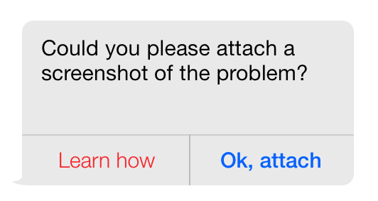 |
| Send | Text for screenshot widget send button and send button on navigation bar |
| We couldn't find an FAQ with matching ID | Body of alertview that shows when there is no FAQ found with an ID passed in showSingleFAQ API |
| Failed to load video | Text shown in FAQ body when there is a failure in loading video |
| Failed to load image | Text shown in FAQ body when there is a failure in loading image |
| Hold down your device's power and home buttons at the same time. | Tutorial text for capturing screenshot on iPad |
| Hold down your device's power and volume up buttons at the same time. | Tutorial text for capturing screenshot on iPhoneX and above |
| Please note that a few devices may have the power button on the top. | Tutorial text for capturing screenshot on iPhones before iPhone X |
| Okay | Text for button to dismiss alertview shown for tutorial regarding capturing a screenshot |
| We couldn't find an FAQ section with matching ID | Body of alertview that shows when there is no FAQ section found with an ID passed in showFAQSection API |